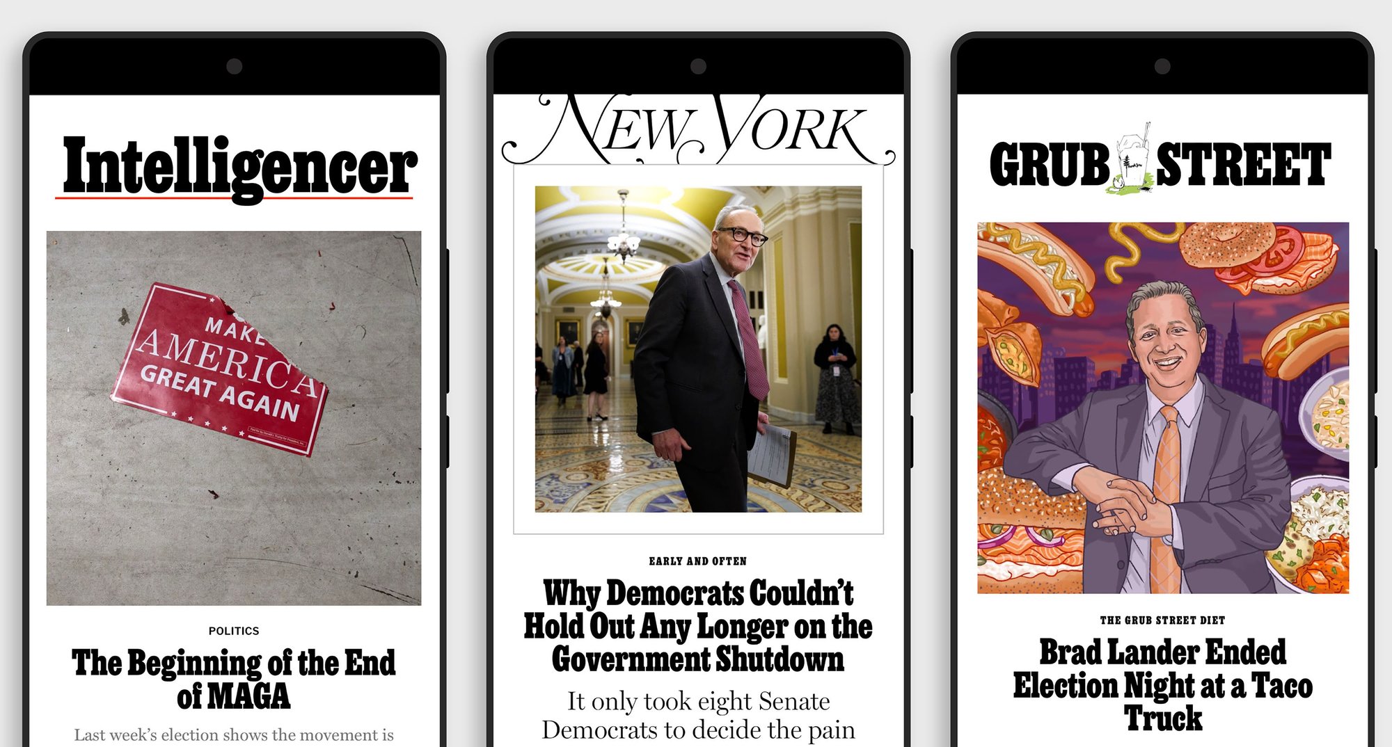
News from XYZ Type

Archive

XYZ’s 2024 review & some fun wallpaper

Fresh wallpaper for the new year

Preview of wallpapers for your screen

As a little gift, Zrinka designed these digital wallpapers for you, using our typefaces Polymode, Study, and Plumbago. Formatted for use on your phone, tablet, or computer.
▶ Download wallpaper

#26
January 8, 2025
Read more

Our new typeface Plumbago 🌸 is now available, after Brand New debut

Animated specimen of Plumbago

Plumbago debuts

Our new typeface Plumbago prioritizes graphic form over typographic convention, with organic octagonal shapes fitted to a monospaced grid. It’s a funky composition: within its rigid measured beat, each character has its own dynamic movement, with ovoid curves butting up against straight boundaries.
To celebrate Plumbago’s debut at Brand New Conference, we’ve released the typeface for early access. We’ve already added two more widths and a lowercase, and we’re planning to expand the family more soon.
▶ Try & buy Plumbago

#25
October 18, 2024
Read more

New custom typefaces, talk, and teammate at XYZ

Specimen of custom typeface for HashiCorp by XYZ Type

New for HashiCorp

We helped HashiCorp’s internal Brand Studio consolidate and refine its typographic palette with a new custom typeface. Working with the studio and with the help of Inga Plönnigs, we brought visual interest, developer flavor, and utility to a family used for product wordmarks, the lead typographic voice on their site, and more.
▶ Read our HashiCorp case study

#24
May 23, 2024
Read more

A new typeface for WK Kellogg Co 🥣

The words Granola & Cereal in the new custom typeface for WK Kellogg Co. by XYZ Type

Thinking outside the cereal box

We’ve carried the heritage of the iconic Kellogg’s logo into a full-blown custom typeface for WK Kellogg Co. Under the guidance of their in-house team and leading critical issues firm Brunswick, we collaborated with Plau to create a proprietary typeface that draws upon the deep history of a celebrated brand.
▶ Read the entire case study

#23
April 24, 2024
Read more

Lyric, a typeface that sings in wide range 🎶

Animated specimen for the typeface family Lyric

Choose Lyric for your voice

Mannered, funky, decorative, and stately: our typeface Lyric sings in a surprisingly wide range. You may have seen this one before—it has already been used beautifully for several restaurants, book designs, and packaging systems. Jesse started Lyric early in his career, and he has finally picked it up again with an eye toward finishing it. Now it’s publicly available, while still in progress.
▶ Try & buy Lyric

#22
May 25, 2023
Read more

Custom-tailored fonts 🪡🔡

Custom tailored fonts

What can we customize for you?

Designing a full custom typeface is the ultimate luxury for a brand, but sometimes a simpler solution can provide similar benefits: modifying an existing typeface to meet specific needs. In a new article on our site, we use our typeface Escalator to demonstrate how we can edit one of our fonts to match your logo, redesign individual glyphs for ownability, and more.

▶ Read “Custom-tailored fonts”

#21
February 15, 2023
Read more

Blow your budget on fonts! 🔡💸

Happy end-of-the-year email season from Ben & Jesse

Blow your budget

We’ve worked corporate enough to know that if you don’t spend down that design expense account by the end of the year, it will be smaller in the next year.

Make accounting happy by zeroing out that account by buying fonts. As an incentive, we’re running a 30% discount until December 31st. Just use BLOWMYBUDGET when you check out. And if you’re looking for other foundries to spend money with, you’ll find a great list at Matthew Smith’s typefoundry.directory.

#20
December 15, 2022
Read more

🎉 Grep -r  v0.1 *.otf

Specimen of the typeface Grep by XYZ Type

Grep in progress

We’re finally making one of our secret weapons available to you. Ben’s typeface Grep has been the cheerful body-copy voice of our company since we started. The design’s circuitous path began when a major tech company asked for a screen-oriented sans—read more about it on our site.

Although Grep is still in progress, we’re making it available for licensing now. Licensees of the current version (v0.1) will receive future updates to the family as they become available.

#19
November 22, 2022
Read more

New trial options 📋

Hello again! We don’t usually send emails this frequently, but there’s so much to tell you about what we’ve changed for XYZ Type version 2.0! (It’s not just our website that has changed.)

Font licenses, simplified

Simplifed font licensing
#18
August 25, 2022
Read more

Use fonts before they’re done. (And 📕👀 the new Rolling Stone logo!)

Red alert!

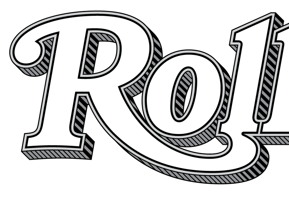
We partnered with Type Network to design the new logo for Rolling Stone magazine! (Yeah, we can’t believe it either.) Check out our full case study for the new logo system, which was unveiled today.

▶ Rolling Stone logotype

#17
August 18, 2022
Read more

Variable fonts are here, now. 🔀

Welcome to part two of our August series about everything that’s new at xyztype.com. Thanks for following along!

Variable fonts are here, now.

Demonstration of variable fonts
#16
August 11, 2022
Read more

Introducing the new xyztype.com! 🍾

Hey XYZ Type fan,

Ben and Jesse here. Thank you for your ongoing support of our independent foundry and for joining this list. It’s been a while since we’ve sent an email, and suddenly we have a lot to tell you. We’ll be distributing some big news in four more emails over what remains of August. (We won’t be offended if you prefer to declutter your inbox and click unsubscribe.)

But first, the biggest news of all:

We have a new website!

#15
August 8, 2022
Read more

A polymodal variable font, a lecture, & an interview

Image of Polymode, the typeface

How can a typeface be a studio?

For Polymode Studio, the answer was Polymode Sans, a custom variable typeface family with an axis for Realness. We love talking about this project because it sheds light on the mysterious powers of variable fonts. Here are two ways to learn more!

Attend our free lecture about/with Polymode

#14
March 29, 2022
Read more

No one needs another geometric sans

Type specimen saying: No one needs another geometric sans.

But we have two more for you! We’re pleased to share a preview of Escalator and Elevator, two new typefaces that are almost done. Visit the minisite to see more, and contact us to purchase an advance license to these in-progress families.

See lots more of these typefaces on the minisite designed by Faculty at 
geometricsans.com.

Images showing the different lowercase a for Elevator and Escalator, two typeafaces by Jesse Ragan
#13
December 16, 2021
Read more

How XYZ spent 2020 (also cookies)

A dumpster fire with sprinkles

Has it been a year or a decade? All we know is that 2020 was hard for everyone, and time became amorphous. Through it all, your support of our foundry has been a bright spot—topped off by Kara Gordon’s heartwarming review of Aglet Sans, which appeared on Typographica just this morning. We are feeling the feels!

Although it wasn’t the year we had planned, we did manage to get a few things done...

Our fonts as cookies by Victoria Rushton
#12
December 23, 2020
Read more

Cedar branches out in version 0.2 🌲✨

Five new weights of Cedar

Image of Cedar's lowercase g in all weights

Since its January debut on Future Fonts, Cedar has grown from three weights to eight! The typeface’s unique angular logic yields dazzling graphic forms in the extremes, from the whittled-down Thin to the sturdy Ultra.

The typeface is still under development—italics and character set expansion are planned for future updates. Get version 0.2 now, and Future Fonts will keep you up to speed with free updates as Cedar continues to grow.

#11
October 14, 2020
Read more

We’ve got prints! 🖼

Aglet Mono Poster dappled by sunlight

We’ve got prints!

In this vibrant Risograph print, Kelli Anderson cleverly deconstructs letterforms from our new typeface Aglet Mono into five colors of overlapping ink. This frame-ready counterpart to an animation Kelli made doubles as a cheat sheet for two-letter Scrabble words.

If you license Aglet Mono—even just one font style—we’ll drop a print in the mail to you! Or if you only want the print, it’s now available at stuff.xyztype.com. (offer valid until 12/31/2020)
► License Aglet Mono & get a free print ($30)
► Purchase a print alone ($10)

#10
August 4, 2020
Read more

Aglet tackles the monospace puzzle 🔡 🧩

Aglet Mono’s offbeat rhythms

Riso animation of Aglet Mono by Kelli Anderson

Eminently practical and a little eccentric, Aglet Mono joins the Aglet superfamily. Like Aglet Slab and Aglet Sans, it builds on a fundamental structure of roundness, which tempers its modular, fixed-width rhythms and distinguishes it from other typefaces in the genre.
► Get to know Aglet Mono

Letters from Aglet Mono in a grid
#9
July 28, 2020
Read more

Ballast weighs in on Future Fonts

Ballast v0.1 released

Ballast packs a punch

Ben Kiel’s new typeface Ballast is here, hot on the heels of the release of Cedar. Version 0.1 of both typefaces are available exclusively from Future Fonts. Ballast’s strong but playful voice comes from a unique strategy to shift weight into balance while maintaining tight clearances. Bulky shapes pack into spaces carved out of other strokes, creating curled counterforms that provide a diversion from the monotonous rhythm of slab serifs.

Ballast Riso macro shot
#8
February 4, 2020
Read more

Timber! 🌲 Cedar just dropped on Future Fonts.

Cedar v0.1 announced

Harvest Cedar while it’s a sapling

Our upcoming typeface Cedar has made an early debut, exclusively on Future Fonts. Designed by Jesse Ragan, Cedar’s puzzling system wraps rudimentary vector shapes around calligraphic structures in a hand-carved aesthetic.

Specimen of Cedar
#7
January 21, 2020
Read more

You make us useful

You make us useful

One of our most rewarding experiences as type designers is seeing the fonts we’ve created used well, so we love Fonts In Use, the public archive of typography. Here are just a few wonderful and unexpected examples—you can see more at fontsinuse.com.

Thank you to the graphic designers who make our work worthwhile!

— Ben & Jesse

#6
November 11, 2019
Read more

Aglet Sans, a new companion for Aglet Slab

Animated gif showing various scales and parts of the typeface family Aglet Sans

Just like Aglet Slab—but less so!

(Less serif, that is.)

Aglet Sans is the new streamlined companion to our previous release Aglet Slab, sensitively redrawn but springing from the same ethos: roundness is a disposition, not mere ornament. Narrow and straight-sided, Aglet Sans playfully exploits a system of angles and corner radiuses to arrive at a vocabulary of shapes that becomes more diverse and intriguing as it grows heavier, and feels as at home in editorial design and corporate branding as it does on the web.

#5
April 17, 2019
Read more

📓 Release notes: The design of Study

The original S and s of Study overlaid with the digital version

Resuming where Ruzicka left off

Released last month, Jesse Ragan's Study is the result of a hypothetical dialogue with Rudolph Ruzicka. In a new post on our site, Jesse details the process behind bringing the design from a hand-painted alphabet to a comprehensive digital typeface family. With historical background and analysis of design decisions, the piece provides a personal look at how one typeface was made.

Read the full post ☛

#4
December 12, 2018
Read more

A new serif typeface: Study 🎓

Glyphs from the typeface Study

Study, Ruzicka’s lost typeface

Our newest typeface has been waiting fifty years to be finished.

Study is based on an alphabet concept by designer and engraver Rudolph Ruzicka, first published in 1968 but never completed as a typeface. Now our own Jesse Ragan has reimagined it as a stunning 12-style family, full of unexpected twists and turns.

#3
November 15, 2018
Read more

Find us on Adobe Typekit & Fontstand ✅

Animation of our fonts syncing

Find us on Typekit & Fontstand

Great news—all of our fonts are now available on Fontstand and Adobe Typekit, for desktop use and as hosted webfonts. We’re proud to partner with our friends at these two unique font licensing platforms.

Sync with Typekit

#2
October 18, 2017
Read more

XYZ Type, a new foundry from Ben Kiel & Jesse Ragan

Animation of all the periods from our typefaces falling down in a jumble

Starting at the End of the Alphabet

We’re proud to unveil XYZ Type, our new independent type foundry. This marks the debut of Aglet Slab and Export, two original typefaces, joined by our previous release, Cortado.

Free trial versions of every font are available on our site, so we hope you’ll download them and put them to work. We can’t wait to see where they end up.

#1
May 3, 2017
Read more
Are.na Bluesky LinkedIn Instagram
Powered by Buttondown, the easiest way to start and grow your newsletter.