A new slab serif for New York mag & updated custom services
The iconic chonky slab serif of New York magazine gets the update it deserves, and our website goes more into depth on our custom services.
Legacy meets a limit
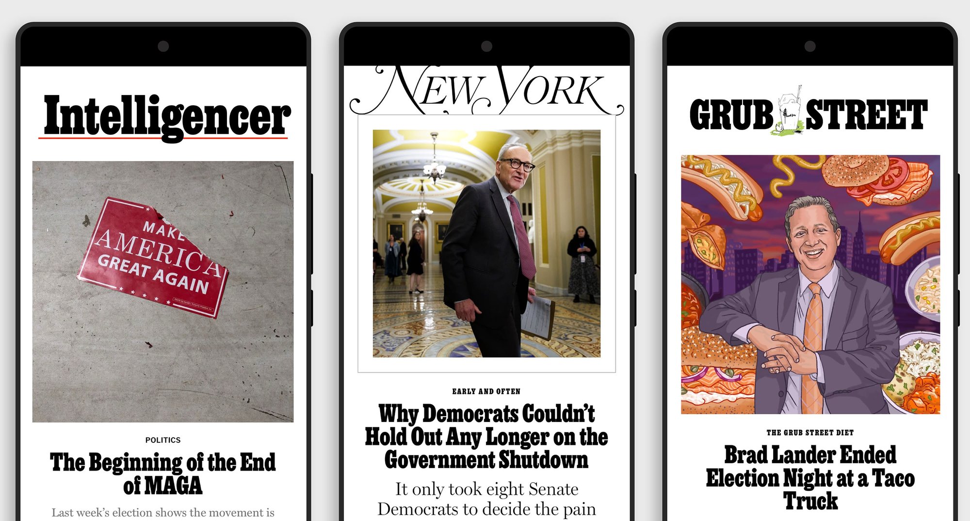
We worked with New York magazine’s Ian Adelman and Thomas Alberty to update and improve the iconic chonky Egyptienne slab serif first used in the 1960s when Milton Glaser chose it as the display typeface for the magazine.
New services & updated site
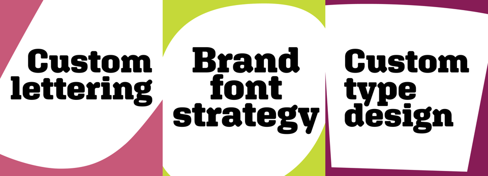
As part of our annual website refresh, we greatly expanded the explanations of the custom services we offer, including our Brand Font Strategy service, in which we guide clients through the sometimes complex process of updating their brand’s typographic pallette.
Chappell Ellison provided expert help on our content strategy, supplemented by new design elements by Vanna Vu. GrayBits pulled everything together with web design and development. (You may also notice our site is now set entirely in our typeface Escalator.)

Behind the scenes
Curious about the reality of running a small, independent type foundry? Background Layer is our behind the scenes newsletter on how and why we do this work.
We share early access to works in progress, our fumbles and recoveries, and our recommendations for art and things we love. Beyond that, we like to occasionally ponder big questions that we’re not sure anyone has the answers to.
Some recent things (more in the archive):
Bard College Hessel Museum’s Baghdad Modern Art Group exhibition
A two-part podcast series by Hanif Abdurraqib on the album, The Score, by the Fugees. Side A and Side B
Our Mexico City food obsession Maizajo
Type Today’s interview of Erik van Blokland
Jon Batiste Making Any Song Blues
We send this out roughly monthly, so it’s not going to overwhelm your mailbox.
You just read issue #27 of News from XYZ Type. You can also browse the full archives of this newsletter.